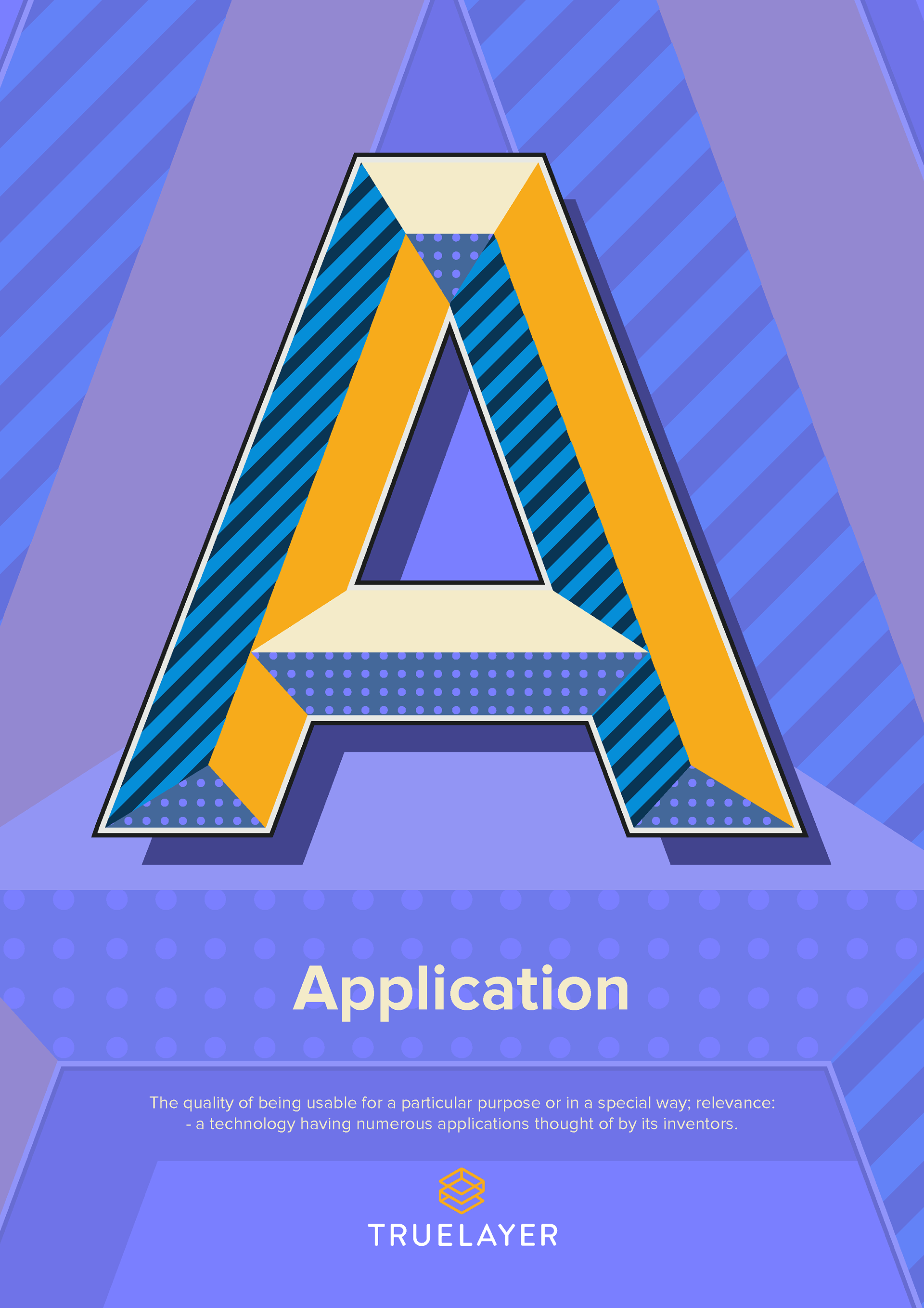
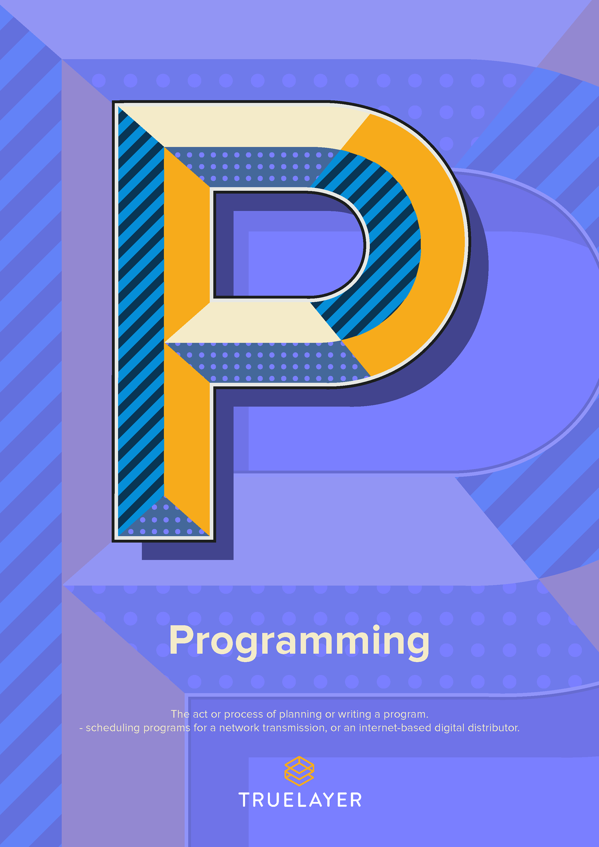
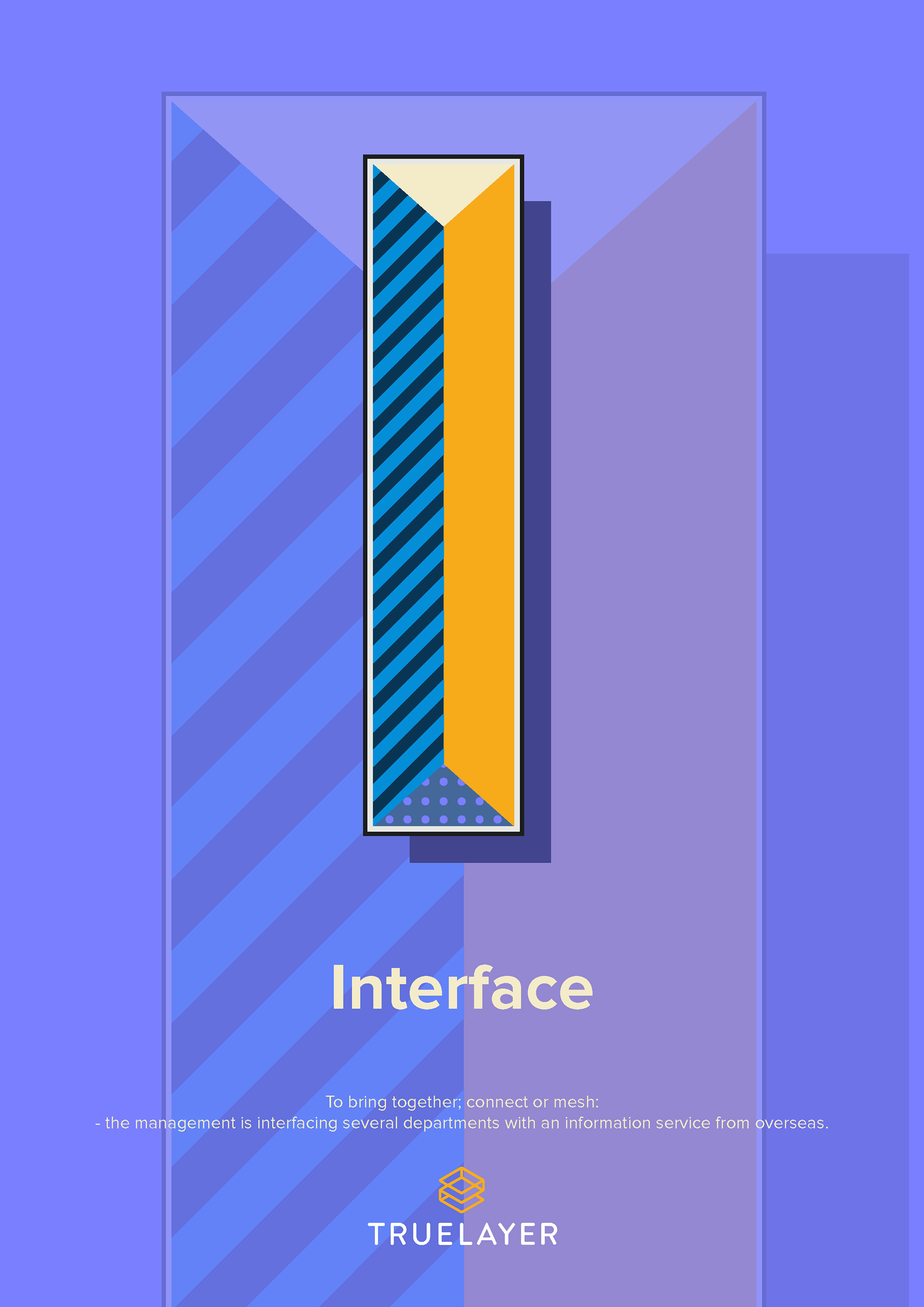
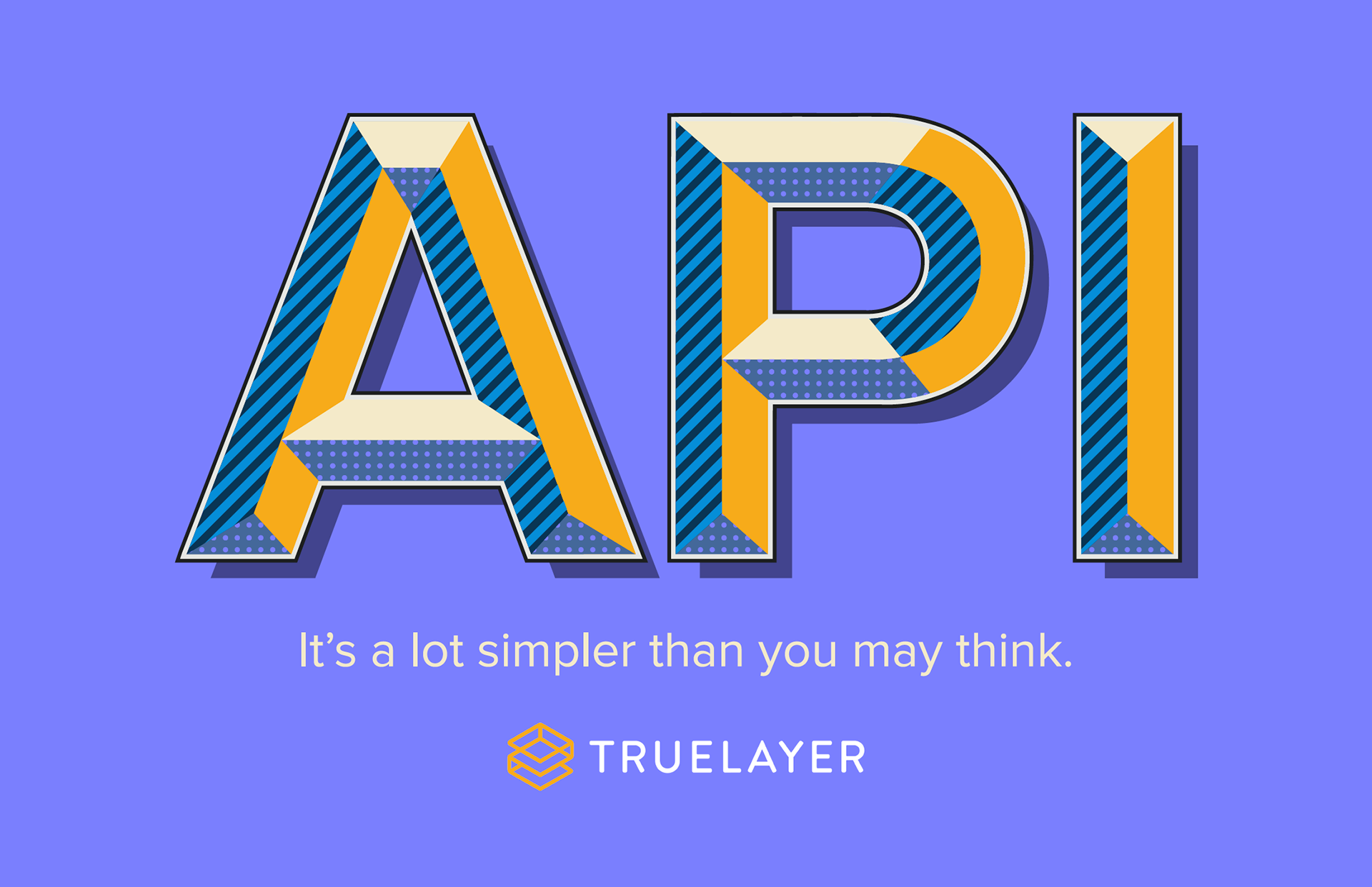
An 'Application Programming Interface' is a lot simpler than you think.
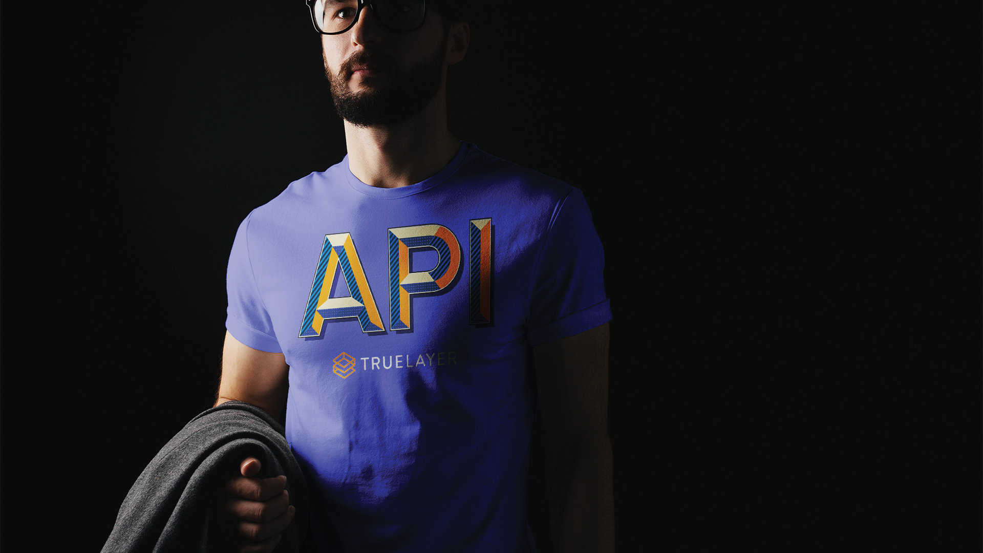
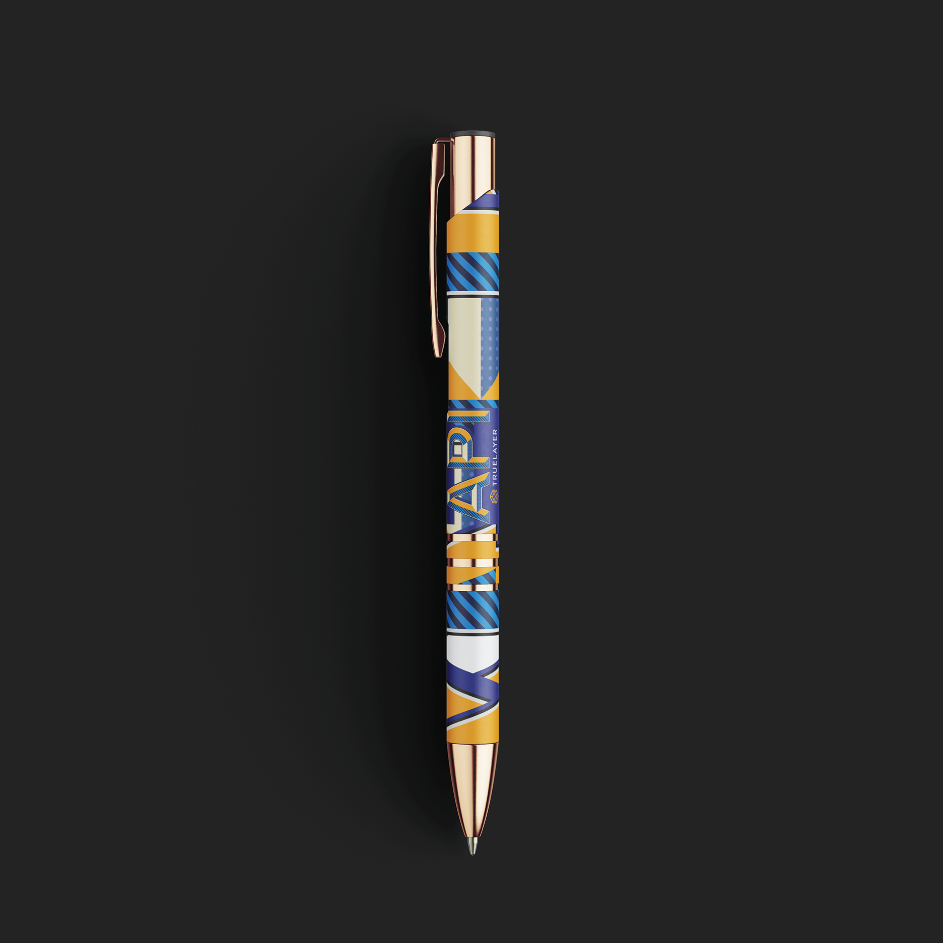
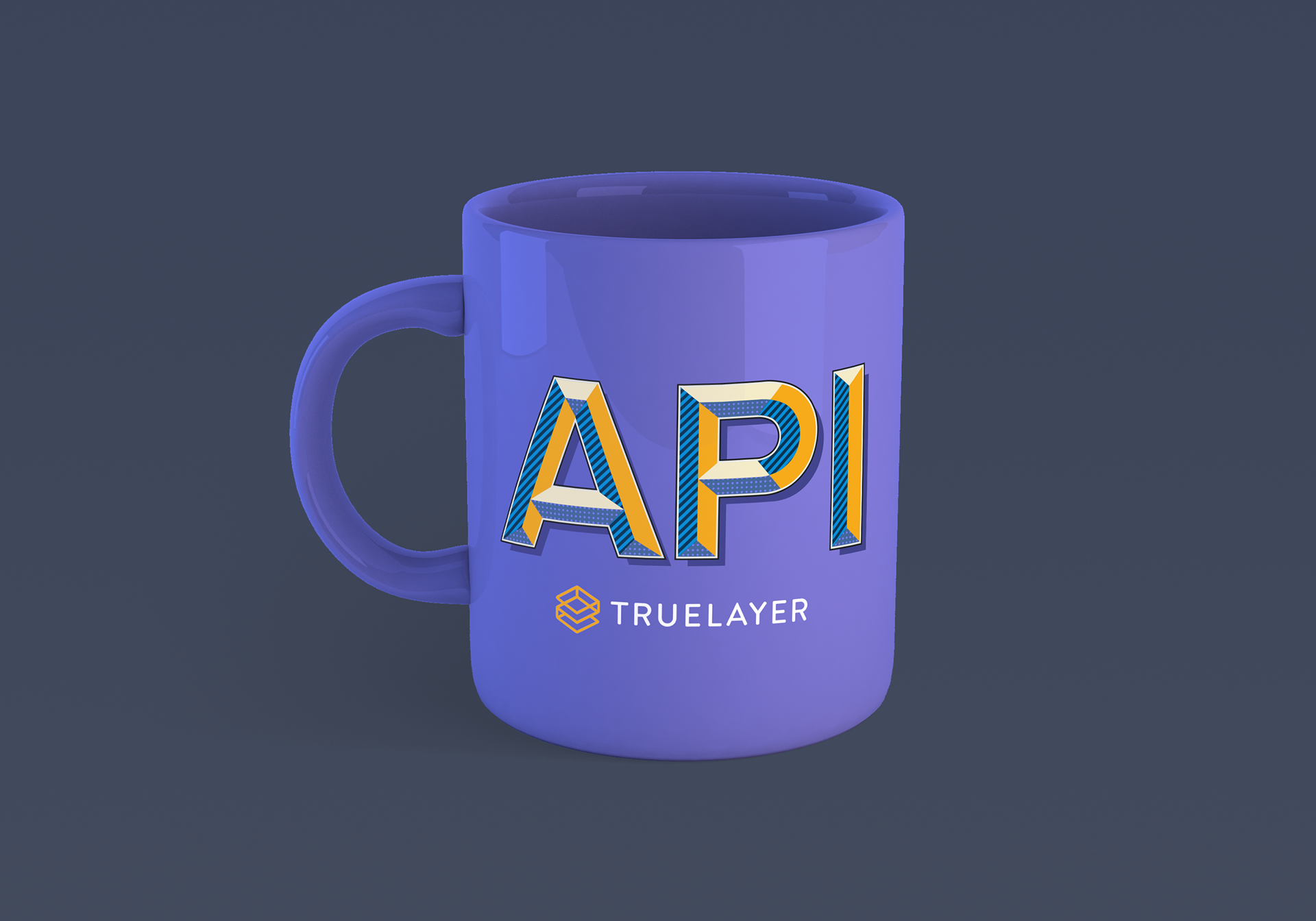
TrueLayer set myself the assigned brief of creating a new and engaging aesthetic for their brand that screams 'fun and cool' to bring new clients and designers into their booth within a networking event.
The task: "to describe what an 'API' is in any capacity to grab the attention of the client".
The client: "non-designers and potentially newly interested TrueLayer applicants".
Throughout their brand guidelines I mustered up the vibrant colour coordination that flows through each poster design, business cards, leaflets, banners, stationary and apparel - a collection of media to present with.
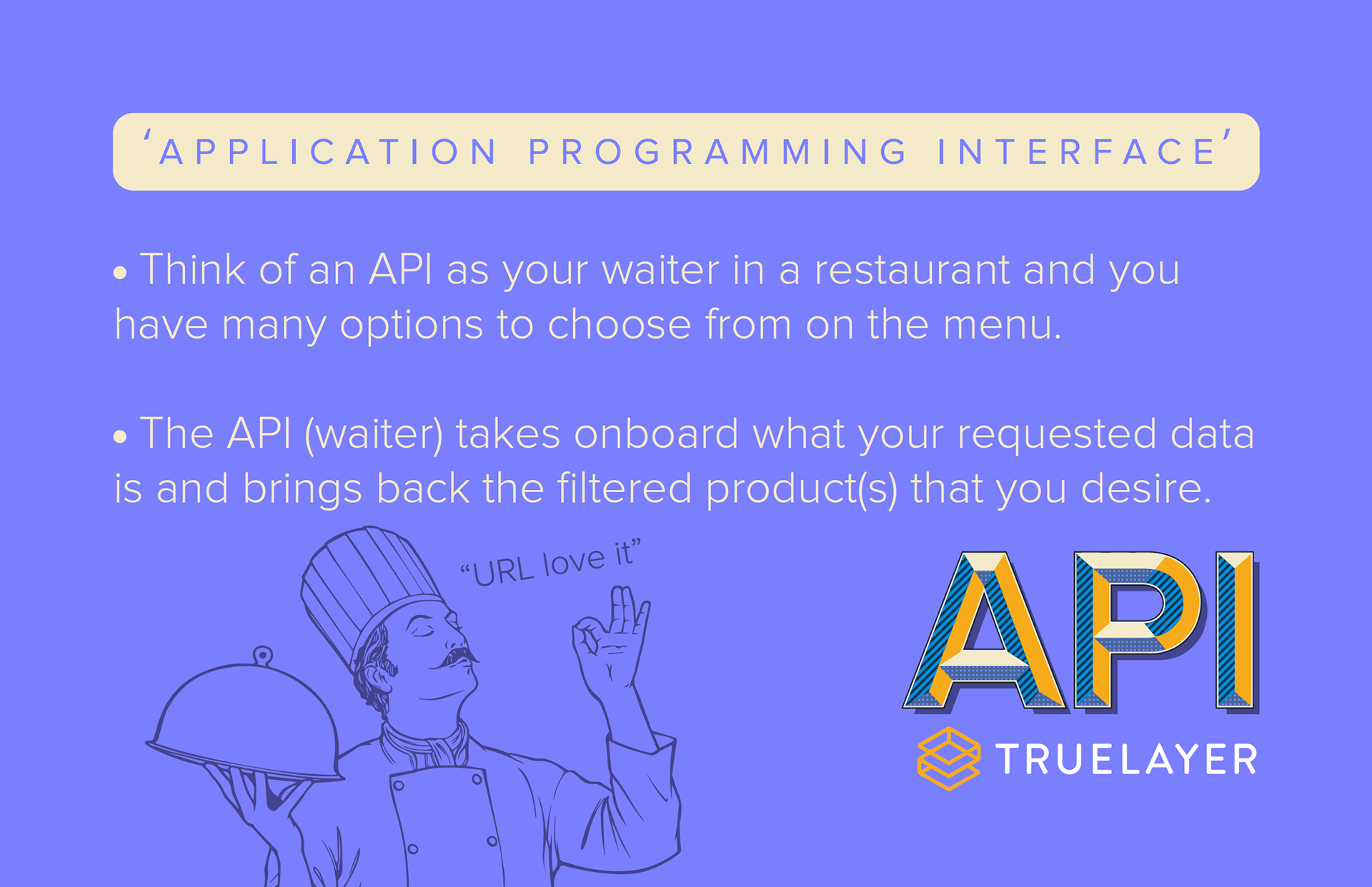
The mixture of 'newbie' knowledge and more professionally in-depth material gave each piece a linear learning curve to hook the client / applicant for further growth and interest.
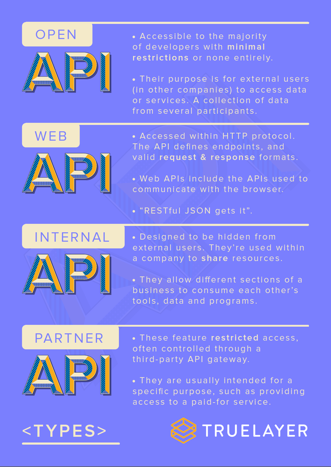
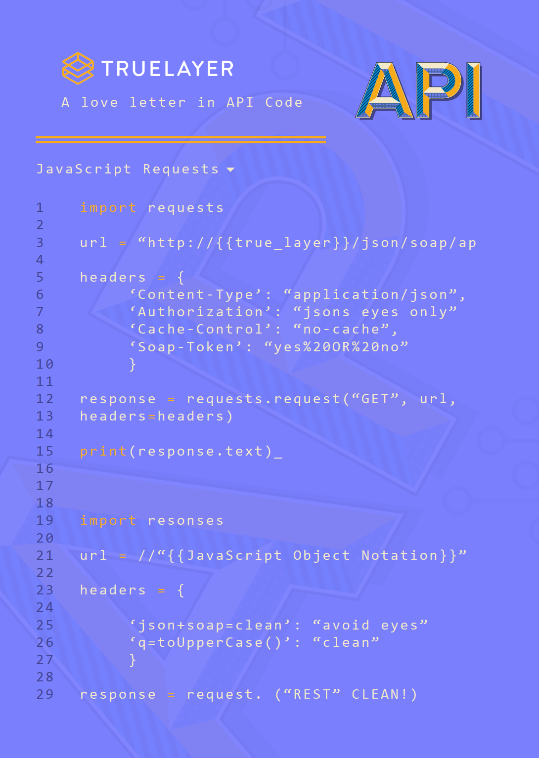
Using the research I gathered from the basic entry-level to the more complicated side of things I progressed up the ladder of complexity yet keeping the design simple overall to focus on the underlying message.
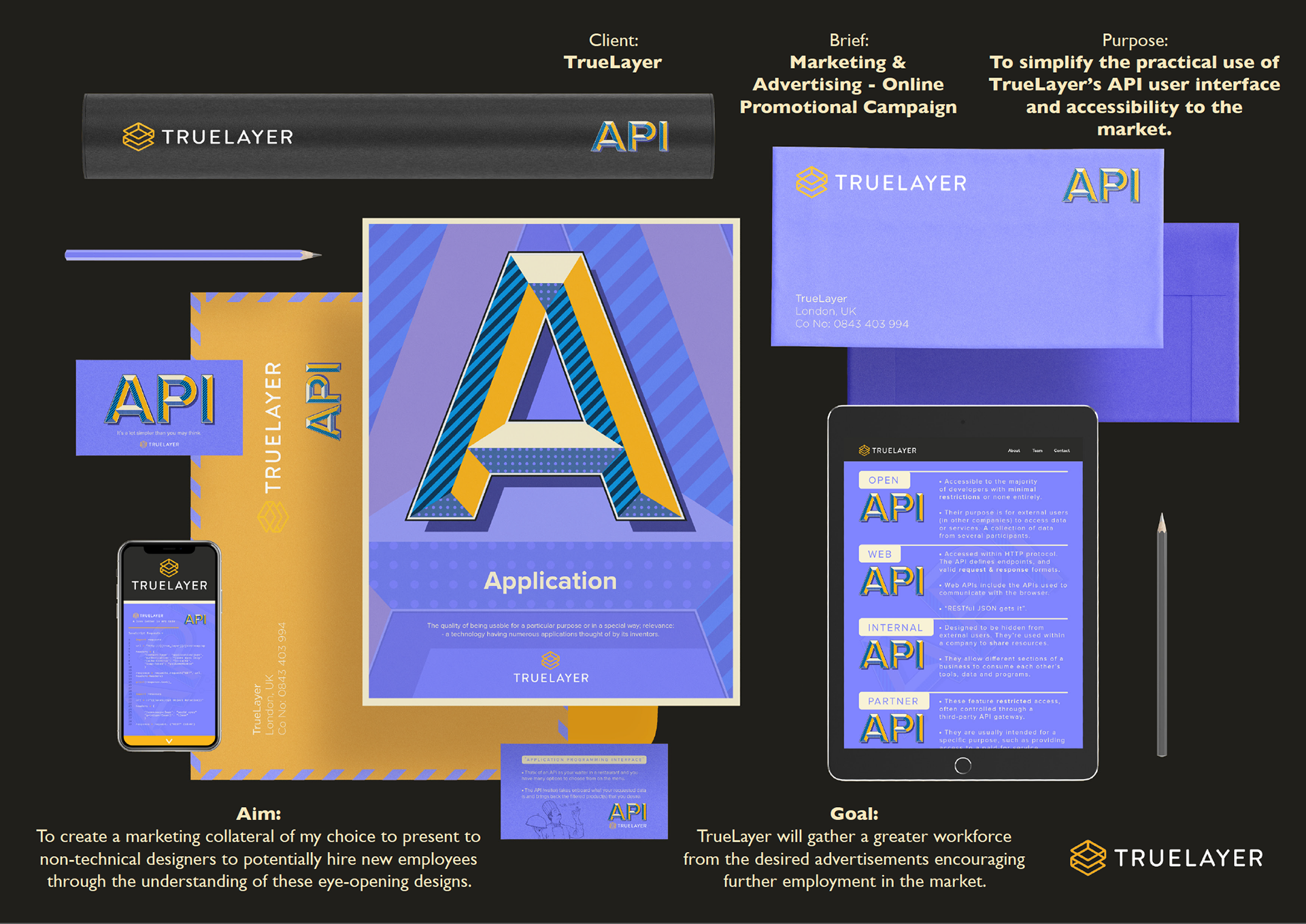
Further development through stationary - giving the overall encompassing cliental that you may find at networking events that want / need any of the above options - along with the TrueLayer staff on the booth.