The Ubox product would then go onto being sold within the National Portrait Gallery + WHSmiths.
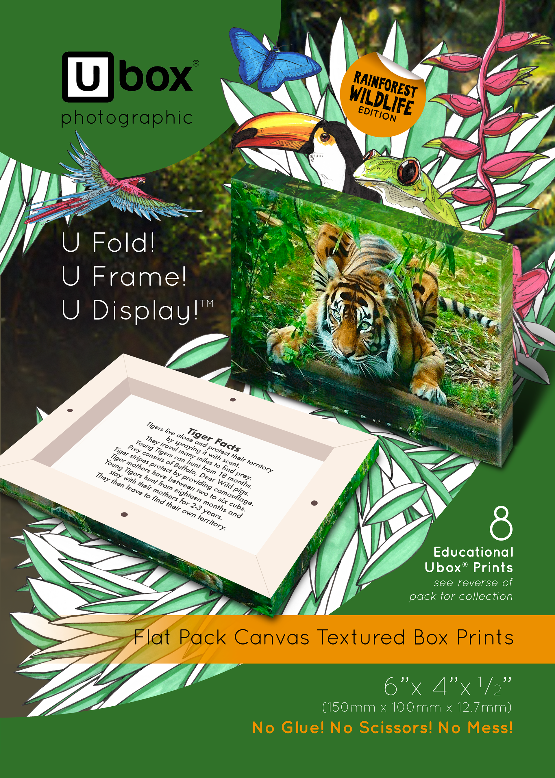
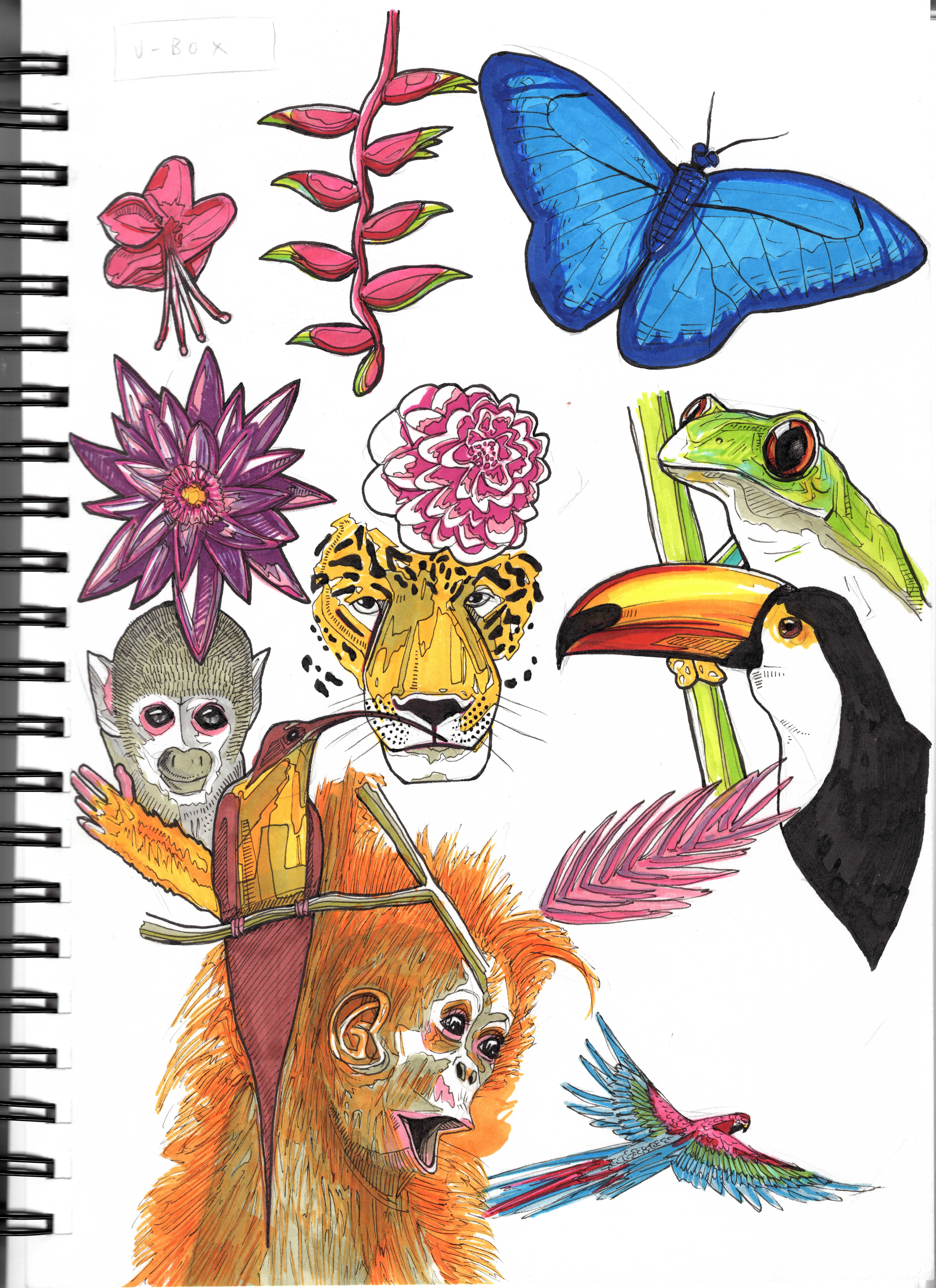
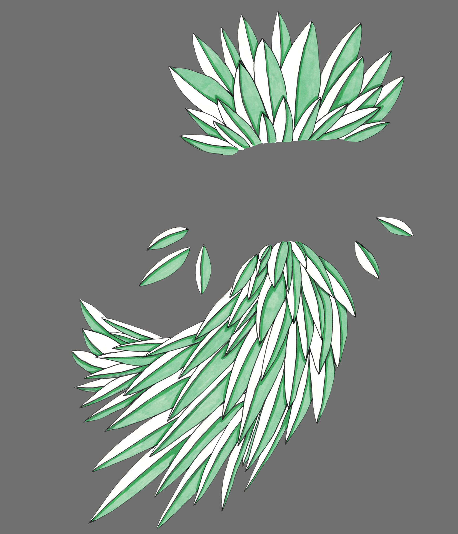
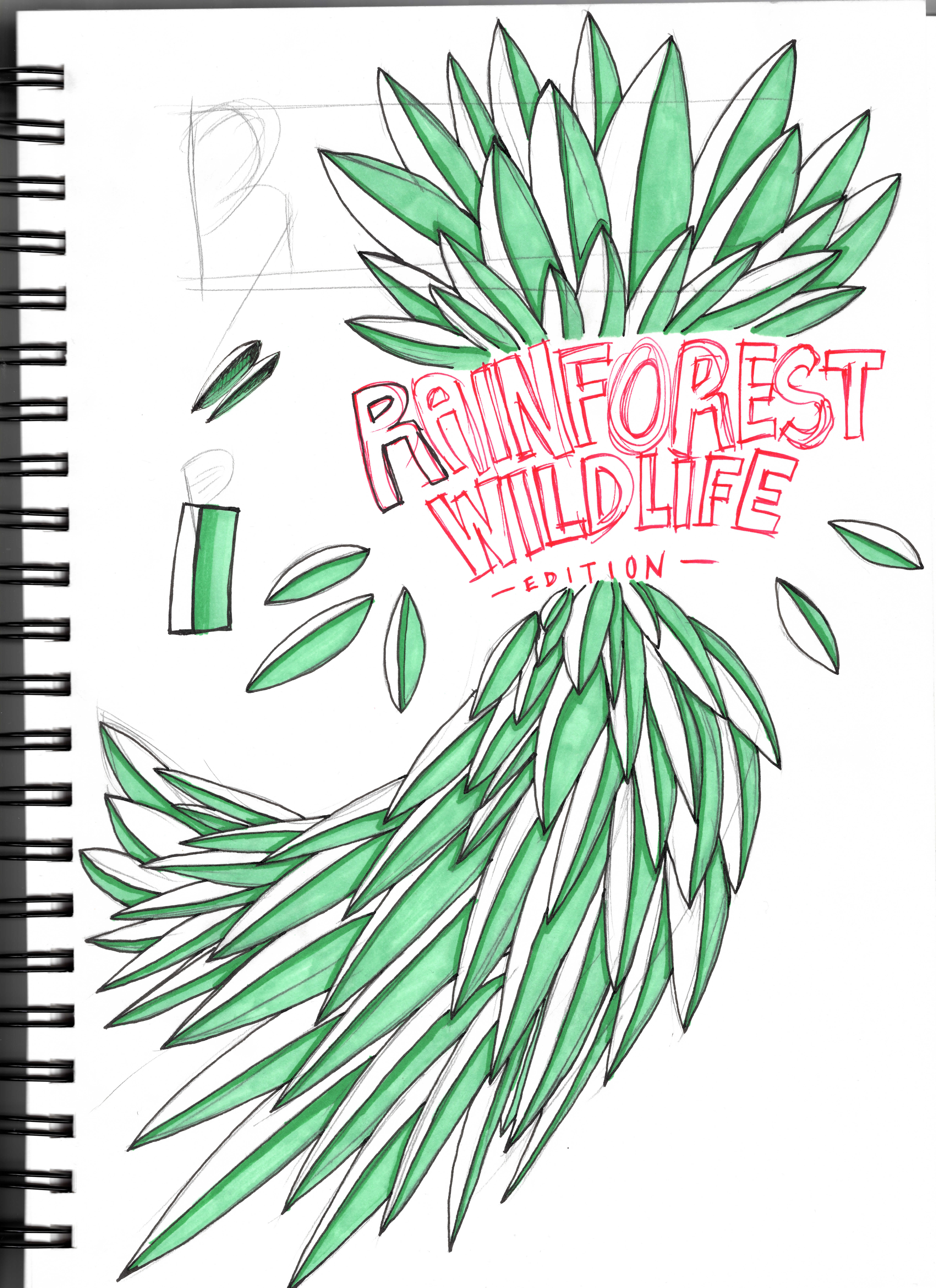
The initial illustrations were hand drawn onto bristol board stock card, allowing the ProMarkers to be used as the ink to colour the subjects with no ink bleeding into the page. The characters were very well received by the client and picked a select few to be used for the 'Rainforest Wildlife' edition.
After character confirmation, I cleaned up the illustrations in Adobe Photoshop + Illustrator before taking them back into InDesign for the Ubox packaging final design.
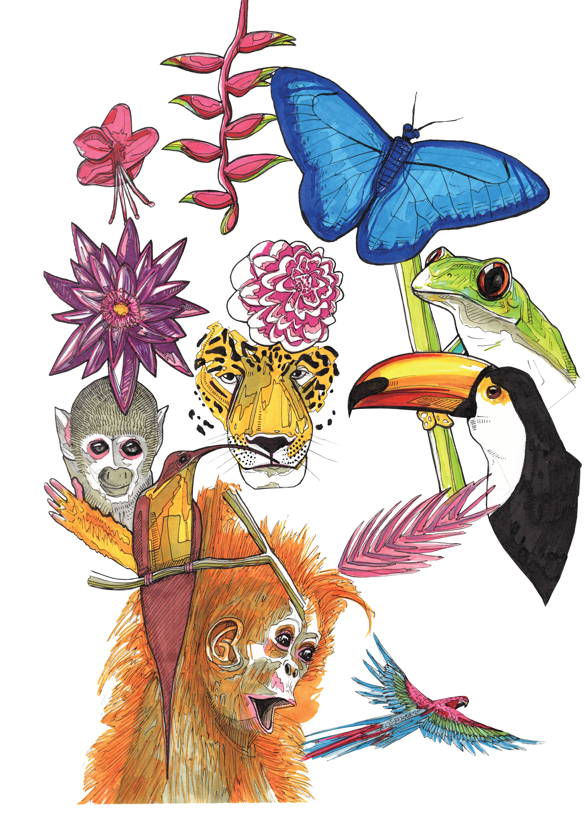
The background of the leaves adds a "home-grown" energy to the packaging, which caters to the desired demographic of young children (aged 5 - 10 yrs), the hand drawn aesthetic to the packaging implements a wholesome individuality to it.
The client's very happy with this aesthetic + will continue using this packaging aesthetic through their 12 piece Ubox series.